Just a quick post – if you’re an OS X user, you’ll know about Spotlight. Basically, it acts as a form of system wide search, allowing documents, applications etc to be located and opened. Something you may not know however, is that you can use it to perform math equations. I do this many times over the course of a day, saving me from having to open the calculator app on my Mac or iPhone. Naturally, it operates according to BOMDAS (BODMAS) which allows for equations such as: (8^2*5)/25 to be entered. Try it out: CMD + Space.
Optimal Adobe After Effects Render Settings: 4 Core, 4 GB RAM
Fortunately, I’ve landed a few jobs recently involving heavy work in After Effects. While for the most part the work’s been extremely fun, trying to get fast/full RAM previews was really frustrating. I often found myself purging all memory every couple of minutes. To top it off, after a recent upgrade to CS6, After Effects began to display the dreaded ‘RAM Preview needs 2 or more frames to playback’ before EVERY RAM preview. After a bit of research and experimentation, I’ve found for my Macbook Pro (2.7 GHz Core i7, 4GB RAM) that a disk cache of ~10GB seems to be just about right (although this will obviously depend on the type of work you’re doing). Turning ‘Render Multiple Frames Simultaneously’ on had very little impact. Multiple forums seem to agree, claiming that more RAM would be needed for that feature to be beneficial.
Although I no longer really need to, I will often purge all memory (both from ‘Edit > Purge’ and using the ‘purge’ command in Terminal). I’d say it would probably be more important to monitor the disk cache however (and empty its contents if it’s close to your limit), as it will sometimes fill up without releasing.
Since doing this, I’ve never seen the error message, and RAM previews and final renders are a LOT faster and longer than before. I’d also recommend upgrading to a SSD… the benefits of that alone are insane.
Posted in After Effects
Tagged adobe, after effects, mac, os x, render, settings
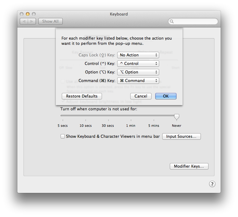
Why I Disabled the Caps Lock Key
When was the last time you used the Caps Lock key on your computer? For some of you, it may be hard to remember. After asking myself this question, I could only recall the times it had been pressed accidentally – and boy did that drive me crazy. Especially annoying was transcribing hand written notes, as it would often be more than a sentence later that I’d look up and realise my mistake. Now for my ego, and so I can justify writing this post… I’m going to assume this isn’t just my fat fingered typing that’s letting me down. This happens to everyone, right?
So about a month ago, I disabled it. The result? I still haven’t needed to use the key – literally at all. Plus, I’ve avoided the accidental press that was occurring at least once a week. So, no more incorrect password attempts, and no more uppercase sentences. That’s a win for me. Turns out the Chrome OS Notebook had a similar revelation, and has completely removed the key all together. Times are changing.
So how do you do it? On your Mac:
- Open ‘System Preferences’.
- Click on ‘Keyboard’.
- Click on ‘Modifier Keys…’.
- Select the pull-down menu next to ‘Caps Lock Key’ and assign ‘No Action’.
iOS App Switcher Concept: Multitasking Redesign
Yes, this is another multitasking/app switcher concept video. Why’d I make it? Well one: because they’re fun to do; and two: because every second day you’ll hear someone whine about the lack of ‘actual multitasking’ in iOS, yet most app switching concepts don’t actually attempt to address this complaint. So, taking cues from my imagination and inspiration from current concepts, I began to create and iterate upon a design that is vastly different from the app switching you use every day on your iOS device. Essentially, this post is my attempt to verbalise this design process.
Before I begin though, want to see what the switcher concept would look like on your iPhone 5? Check out this video from your device, to watch an 1136 x 640 demo.
To start, I want to clarify: there is a huge difference between app switching and multitasking. Arguably, Apple’s implementation is closer to the former, as there are limited ways in which you can truly ‘multitask’. Currently in iOS, one ‘active’ app is present on the screen at any given time. Switching to a different app gives it the ‘active’ status, replacing the content that previously filled the screen.
To be honest, the switcher concept is also likely categorised as app switching than multitasking. However, it has some significant differences/advantages, that start to bridge the gap between the two terms. Probably the most beneficial advantage, is it’s ability to allow apps to maintain a ‘semi-active’ status even when not in use. The benefits of such a system are seen in the switcher concept video, where the user is able to switch between the Mail, Haze and Flipboard apps, whilst watching them update live. There are more benefits then simply live updates however. For example, the combination of full app previews, the large icon and name presented underneath each app, make it much more obvious which app you’re switching to, and prepares you for what to expect when revisiting that app. The switcher concept also solves the problem in which the iPhone’s screen is too small to use multiple finger gestures (as the iPad does to switch between apps). By double tapping the home button, you are now in the switcher, and are able to switch between apps in a manner similar to an iPad. Further, it allows for prime positioning of the toggles, brightness and music controls. By separating the controls from the apps, they can now be positioned off to the left and right of the screen, minimising total swipes.
Additionally, a simple but largely useful aspect of the concept is included in the search function: simply type the name of the app you’re after, and it will appear. Yes, I realise spotlight provides system wide search already, but that’s the thing: it searches system wide. The benefit here, is that you’re searching for apps and apps only. This will ostracise apps from other general data, allowing them to be found much quicker. Plus, you’re seeing a live tile at the same time. In a way, this is similar to launchpad for OS X.
As for the music controls, a scrubber was excluded as it would begin to blur the line between the switcher and an actual music app. My opinion, is that the switcher should provide important controls… accidentally start a loud song in the middle of a church service? Use the switcher to pause or lower the volume. Scrubbing through a song isn’t quite as necessary.
As for the actual design, I decided not to go flat (despite it’s vocal supporters) as that clearly isn’t a large part of Apple’s design ethos… yet. Yes, I realise that neither is the grey gradient used in the background. To me however, that is more justifiable. I tried it with multiple variations of Apple’s linen, but of course it just looked awful. Further, the grey gradient aims to give the music controls better visibility, and act in contrast to apps that may have a similar, uniform background colour.
Finally, during the early design stages, there were plans to have favourite apps ‘pinned’ to the start of the stack, allowing them to be accessed quickly. Issues were evident after more thought however. Most obvious, was that the home screen already provides this functionality. Secondly, it would oppose the whole intent of the switcher, which is to provide easy switching between recently used apps.
So that’s it: my thoughts and justification for my concept. If you haven’t seen the video yet, get to it… I would love to hear your feedback on the design. Also if your interested, check out the original Dribble post here!
Website update: ‘quote’ page coming soon
Why the redirect? My ‘quote’ page is currently being redesigned, as part of my website overhaul. I’ll be posting here once it’s back up and running… although your best bet is to follow me on Twitter for more frequent updates. Otherwise, check out some of my more recent blog posts. I’ll also be updating other areas of the site in the coming weeks. Really high up on the list is a responsive layout, so stay tuned!
What’s this all about?
So, I’ve taken the plunge and have finally decided to try my hand at blogging: not as a ‘blogger’ per se, but as a guy who from time to time has some pretty sweet stuff to share, and is looking for a 140 plus character platform! So this is it.